Introduction: That “Something’s Off” Feeling
Have you ever stood in a room and felt like something was just… off? You can’t pinpoint it, but the space lacks that polished, intentional feel you see in magazines. As professional designers who have spent years learning what works, we can tell you this: that feeling usually has nothing to do with your budget. It’s about small, overlooked design mistakes that quietly betray a lack of intention.
More often than not, achieving a high-end look isn’t about spending a fortune but about making deliberate, curated choices. Luckily, these common missteps are easy to correct. Ahead, we’re revealing six expert-backed fixes that can elevate your space instantly, transforming it from amateur to artful without a major investment.
——————————————————————————–
1. The First Thing Designers Notice: Your TV Console
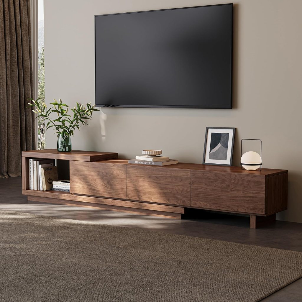
One of the most common mistakes is placing a television on a console that is too small for the screen. The rule is simple: the console or credenza beneath your TV should always be wider than the screen itself. This isn’t just a stylistic preference; it’s about proportion and scale.
A wider console grounds the television, balancing its visual weight and making it feel like an integrated part of the room’s design. A small console signals you bought the TV without considering how it would live in the space—a failure of intention that makes the entire setup feel awkward and cheap. Furthermore, if you can’t accommodate a proper piece of furniture beneath your giant screen, then honestly, the TV might be too big for the room. The same logic applies to a mounted TV panel: it must be large enough to feel like an intentional feature wall, not a small square floating in the middle of an empty wall.
A beautifully proportioned media console can instantly correct one of the most common design mistakes: a television that visually overwhelms the furniture beneath it. Upgrading to a wide, solid-wood, or fluted-front credenza creates the grounding effect designers look for, helping the TV feel integrated into the room rather than floating awkwardly above a too-small unit. Look for consoles with clean lines, closed storage, and a wider footprint than your screen—this subtle change adds weight, balance, and intention to the entire wall.
2. The Builder-Grade Mistake That Shrinks Your Kitchen
That empty space between the top of your kitchen cabinets and the ceiling is more than just a dust collector; it’s a signature of builder-grade design that actively detracts from a high-end look. This gap, often a cost-saving measure, makes the ceiling feel lower and visually crops the wall in half.
While it’s tempting to fill this dusty ledge with fake plants or baskets, this only adds clutter and draws more attention to the problem. The professional solution is to take the cabinets all the way to the ceiling. This change elongates the walls, provides valuable storage, and makes the entire kitchen feel more custom and intentional.
As one designer bluntly puts it:
That awkward gap between the ceiling and the top of the cabinets is not just wasted space; it’s actively working against the room.
If you’re not ready for a full cabinet replacement, a clever designer-approved workaround is to use a cabinet height extension kit or crown molding riser to visually close the gap between the cabinets and the ceiling. Rather than filling the space with baskets or faux greenery, this solution creates a seamless, custom-built look while elongating the walls and making the kitchen feel taller and more refined.
3. Why ‘Honest’ Materials Always Win
Peel-and-stick brick, faux marble contact paper, and plasticky wood veneers promise a high-end look for less, but they often have the opposite effect. The problem isn’t that a material is faux, but when it’s a bad imitation. Cheap fakes create a “visual dissonance” that cheapens an entire space. Not all faux materials are created equal; the key is choosing imitations that are convincing in their texture and pattern, avoiding anything that looks plasticky or obviously manufactured.
Embracing “honest” materials, even humble ones, is a core principle of the quiet luxury aesthetic, which prioritizes authentic quality over loud, cheap imitations. For example, a solid butcher block countertop is a far more sophisticated choice than a laminate counter wrapped in unconvincing faux marble contact paper. Authenticity brings an integrity to a space that poor imitations simply can’t replicate.
This idea is perfectly captured by the observation that
When something’s pretending to be what it’s not and it’s not doing a good job at it, the illusion falls apart fast.
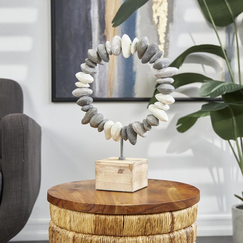
Instead of relying on cheap faux finishes, a single accent crafted from authentic materials—like a solid wood side table, stone tray, or real metal sculpture—instantly elevates a room. These pieces age beautifully, add natural texture, and reinforce the quiet-luxury principle that authenticity reads as confidence in design.
4. The Sophisticated Secret of Asymmetry
While balance is crucial in design, perfect symmetry can often look flat and formulaic. Professional designers know that intentional asymmetry is the secret to bringing life, uniqueness, and a high-end feel to a room. It creates visual interest that guides the eye around the space, making effective use of negative space.
You can easily introduce sophisticated asymmetry with a few simple tweaks:
- Place a tall lamp on one side of a sofa and a stack of books on the other.
- Use mismatched but complementary side tables.
- Create an off-centered gallery wall with slight differences in height.
Just as a deliberate imbalance breaks visual monotony, adding a single unexpected object can break conceptual monotony, which leads to our final point.
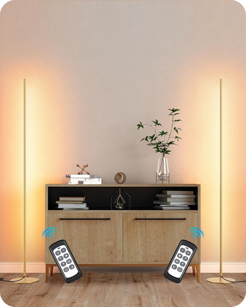
To escape the harsh “single overhead light” effect, designers lean on layered lighting—especially floor lamps with fabric shades and discreet wall-washer uplights that soften corners and expand the perceived boundaries of a room. Adding even one warm secondary light source can transform the mood from stark to atmospheric.
5. The Flaw in Your Single Light Source
Relying on a single overhead fixture—the “big light”—is one of the most impactful design mistakes. This approach casts light downward, creating harsh shadows in the corners. As lighting experts explain, “Dark corners act as visual stop signs. When the edges of a room disappear into shadow, your brain assumes the space ends sooner than it actually does, making the entire space feel smaller and unwelcoming.
Professionals use layered lighting to create depth and ambiance. It involves three distinct types working together:
- Ambient Lighting: General, overall illumination from a ceiling fixture.
- Task Lighting: Focused light for activities, like a reading lamp or under-cabinet lighting.
- Accent Lighting: Light used to highlight artwork, plants, or textures, creating visual interest.
For a true pro-level fix, consider wall washing, a technique where fixtures are aimed at vertical surfaces. This simple trick makes walls seem to dissolve, making the room feel significantly larger and more architecturally refined.
Without layers, you risk creating an unwelcoming environment:
If you are relying only on overhead fixtures, you are basically creating the interior design equivalent of unflattering fluorescent office lighting.
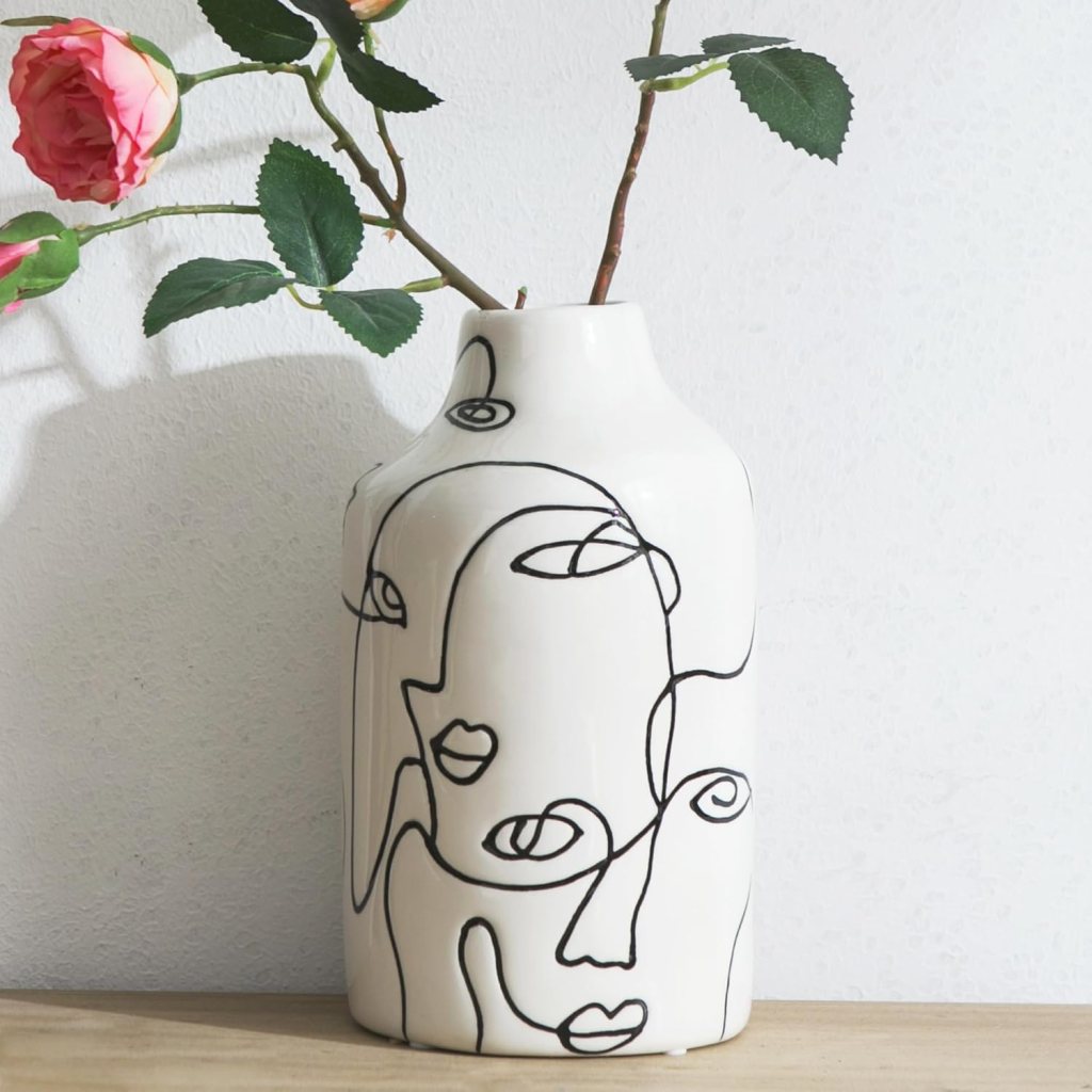
To avoid a space feeling too safe or catalog-like, consider adding one intentional “odd” or sculptural element—such as a bold ceramic vase, abstract art piece, or avant-garde side table. This kind of object introduces tension and personality, signaling curation rather than decoration.
6. The Designer’s Secret Weapon: The ‘Weird’ Element
A room where every piece is safe and expected can feel generic and impersonal. Designers prevent this with a secret weapon: a single standout piece that is unexpected or even a little “weird.” This element acts as a conversation piece, sparking curiosity and telegraphing design confidence.
This object adds visual tension and personality, preventing the space from feeling like a catalog showroom. It doesn’t have to be expensive—just unique. Consider these examples:
- A sculptural, unusually shaped side table.
- An oversized piece of art in a modestly sized room.
- A vintage chair placed among contemporary décor.
——————————————————————————–
Conclusion: It’s Curation, Not Decoration
Ultimately, creating a home that looks and feels expensive is less about a big budget and more about making intentional choices. Each of the fixes above—from balancing the scale of a console to layering your light—is about replacing thoughtless defaults with deliberate curation. As editors at Southern Living note, designers “would rather wait for something specific than choose something safe.” A well-designed home tells a story through meaningful objects, authentic materials, and a clear point of view.
Instead of just filling a space, how can you start telling your story?


Leave a comment